
You are standing at the mirror in a striped shirt, holding a floral skirt against your hips. Something about it is almost brilliant. Something else is almost a mistake.
You take the skirt off, reach for the black trousers, and leave the house looking fine. Safe. Slightly forgettable.
That small moment of doubt is not a lack of taste. It is your visual system doing its job, weighing how much complexity it can enjoy before enjoyment tips into overload. Psychologists have been measuring that tipping point for more than 50 years, and the work on colour pairs in particular turns out to be surprisingly useful in front of a wardrobe.
The short version: a mixed outfit works when your eye can find the order inside it. Here is the science first, then seven rules you can use tomorrow morning.
The sweet spot between boring and chaos
In the 1960s and 1970s the Canadian psychologist Daniel Berlyne, at the University of Toronto, argued that pleasure in art follows an inverted U. Too simple and we are bored. Too complex and we are lost. Somewhere in the middle, things feel interesting and pleasant at once.
One of his experiments, published in 1970, showed people sequences of coloured shapes again and again. Simple patterns grew less pleasing as they became familiar, while more complex ones held their appeal for longer, and some even improved. Anyone who has worn the same plain navy jumper three days running will recognise the feeling.
The curve is not a law of nature, though. In 2016 Yağmur Güçlütürk and colleagues at Radboud University in the Netherlands asked 30 people to rate 144 black-and-white patterns. Averaged together, the ratings made a neat inverted U. Split apart, they revealed two groups: 20 people who preferred simpler patterns and 10 who liked busier ones. Both groups agreed on which patterns were complex. They simply enjoyed different amounts of it.
That is a small study, but it carries a reassuring message.
There is no single correct level of busy. There is only yours.
What 992 colour pairs revealed about harmony
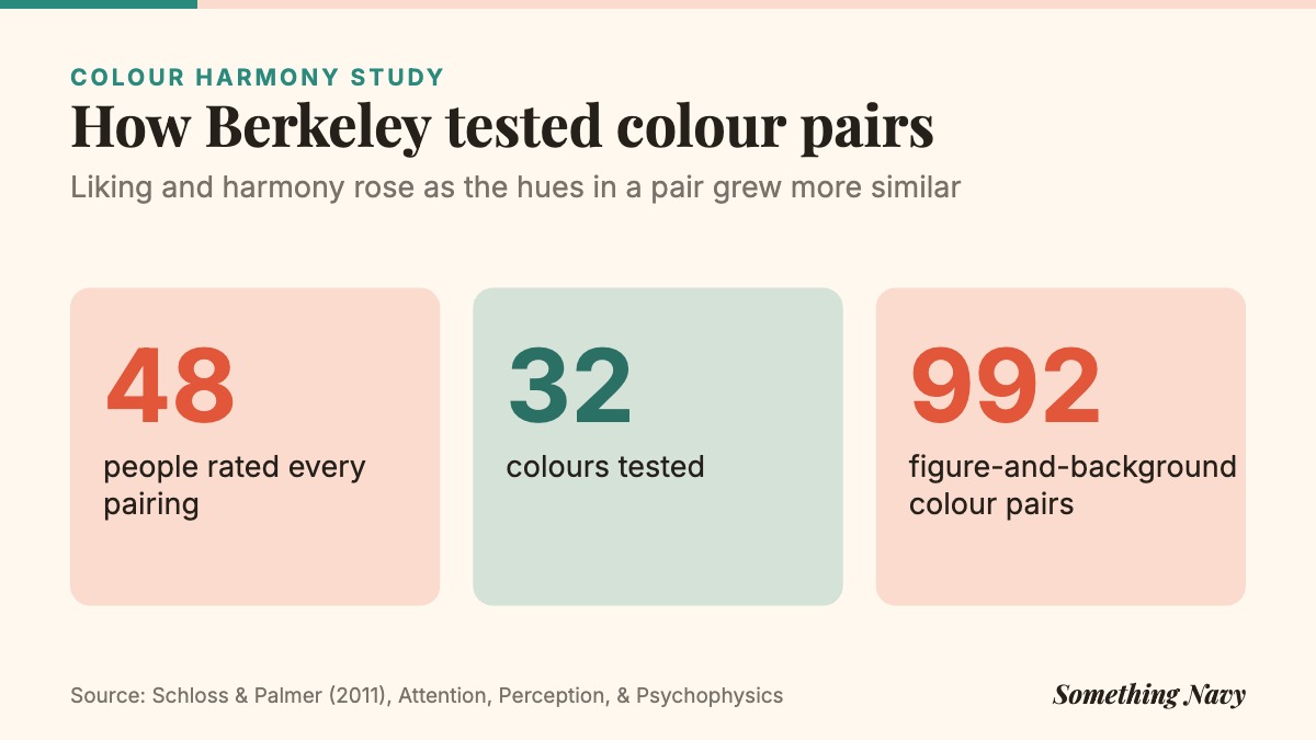
Colour is where most pattern mixes succeed or fail, and here the evidence is unusually detailed. In a study published in 2011, Karen Schloss and Stephen Palmer at the University of California, Berkeley showed 48 people 32 colours combined into 992 figure-and-background pairs, then asked them to rate each pair for preference and for harmony.
Two findings matter for your wardrobe. First, both liking and harmony rose as the hues in a pair became more similar. Pairs from the same colour family scored best; strongly clashing hues were generally judged neither pleasing nor harmonious. Second, people liked pairs more when the two colours differed in lightness, a pale tone against a deep one.
There was a twist. When people rated only the smaller colour sitting on top, they liked it more the more it contrasted with the background. In plain terms, a group of colours looks calmest when the hues are related, but a single accent looks best when it stands apart.
These were coloured squares on a screen, not clothes on bodies, so treat them as a guide rather than a rulebook. Still, they line up closely with what good stylists have long done by instinct.


Being noticed is less scary than it feels
The other barrier to statement dressing is social. A bold mix feels like a spotlight, and most of us flinch from it.
That spotlight is dimmer than you think. In a classic study from 2000, Thomas Gilovich and colleagues at Cornell University had students walk into a room wearing an embarrassing T-shirt. Afterwards, the wearers substantially overestimated how many people had noticed it. Psychologists call this the spotlight effect, and it applies to your clashing prints just as much as to your bad days.
When people do notice, the verdict is not always what you fear. In 2014 Silvia Bellezza, Francesca Gino and Anat Keinan of Harvard Business School published a set of studies on what they called the red sneakers effect. In one field study of 76 academics at a conference, those who dressed more casually tended to have stronger publication records. Across the studies, the researchers argued that breaking a dress norm can signal status and confidence, but only when it reads as intentional.
And there is your own head to consider. The idea of enclothed cognition holds that what we wear can shape how we think and feel. Some early lab results have been hard to repeat, but a meta-analysis of 40 studies by Blaine Horton, Hajo Adam and Adam Galinsky found that later, more rigorous work still supports the core idea.
So an outfit you love may do more for your mood than for anyone else’s opinion. That is reason enough.
What follows is styling advice, not science. But each rule leans on the findings above.
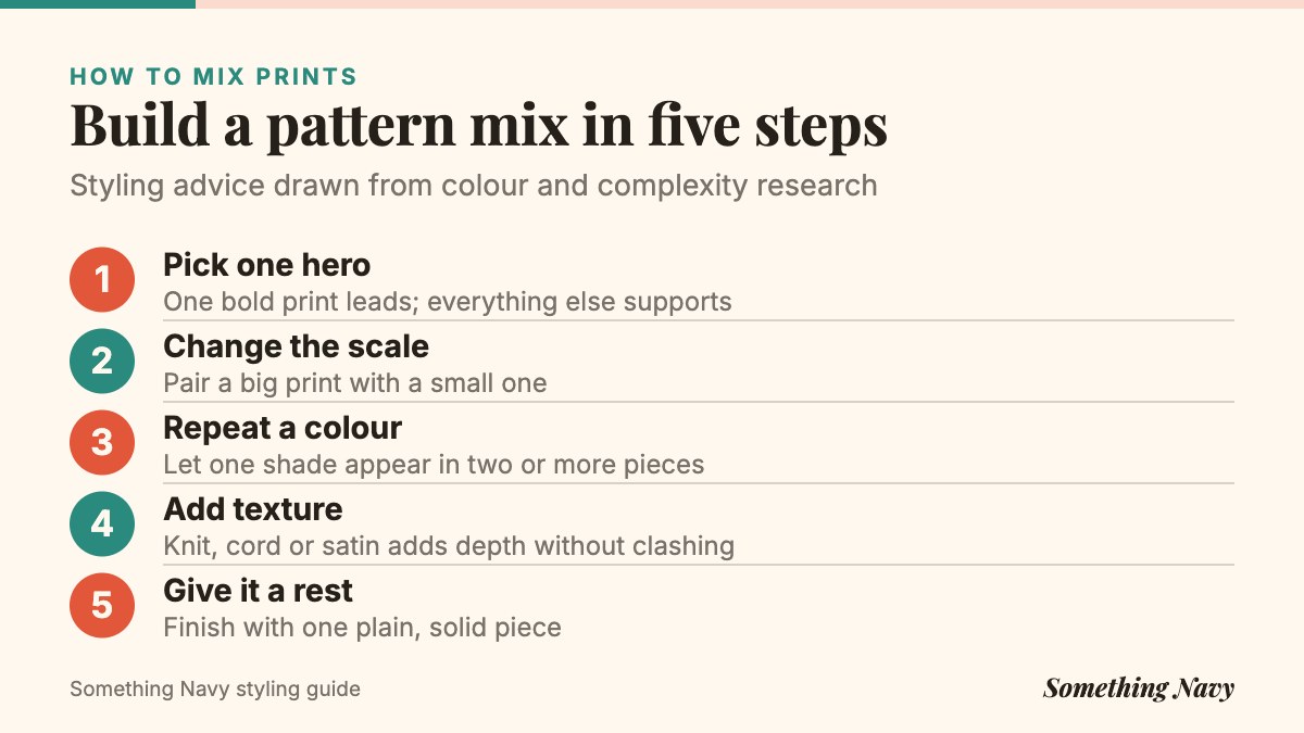
1. Choose one hero and let it lead
Every confident pattern mix has a main character. It might be a bold floral midi skirt, a leopard coat or a graphic print shirt. Pick it first and build outward from it.
This mirrors the Berkeley finding about figures and grounds: a single standout colour or print is enjoyed most when it stands apart from what surrounds it. Two heroes competing for attention is where outfits start to feel like noise.
2. Change the scale, not just the print
Two patterns of the same size fight each other, because the eye cannot tell which one to read. Pair a large print with a small one instead: wide stripes with a ditsy floral, a big check with a fine pinstripe, a large botanical with a tiny polka dot.
A useful test is to step back two metres. If the patterns blur into one muddy texture, the scales are too close. If you can still see two distinct rhythms, you are in good territory.
3. Repeat one colour across everything
The fastest way to make different prints look related is a shared colour. If your floral has a touch of rust, a rust-and-cream stripe will suddenly look planned.
This is the hue-similarity finding at work. The more your pieces share a colour family, the more harmonious the whole tends to look, even when the patterns themselves are quite different.
4. Stay in one colour family and play with light and dark
If repeating an exact shade feels fiddly, stay within a family. Navy, cobalt and pale sky blue. Olive, sage and khaki. Burgundy, berry and blush.
Then vary the lightness. In the colour-pair study, people preferred combinations with more lightness contrast, so a dark print against a pale one usually looks crisper than two mid-tones side by side.
5. Treat texture as a pattern you can’t get wrong
If prints still feel like a leap, start with texture. Chunky cable knit, ribbed cotton, corduroy, bouclé, satin, suede and linen all add visual complexity without introducing new colours or shapes to argue with.
An all-cream outfit of knit, silk and wool can look as considered as any print clash, because the interest comes from how light catches each surface. Think of it as dialling up complexity a notch or two while staying on the friendly side of Berlyne’s curve.
Try this: the two-minute mirror test
- Name your hero piece out loud. If you can’t, you have two.
- Step back two metres and squint. Can you still see separate patterns?
- Find one colour that appears in at least two pieces.
- Point to the plain or textured “resting place” in the outfit.
- Ask if it looks chosen. If it looks accidental, swap one piece, not three.
6. Give the eye somewhere to rest
Even the boldest mixes usually include a quiet zone: a plain coat, a block-colour bag, simple shoes, a solid belt. These neutral pieces act like the white space on a page, separating busy areas so that each one can be read.
If an outfit feels overwhelming, you rarely need to remove a pattern. Often you only need to add one calm, solid piece between two loud ones.
7. Make the clash look deliberate
The red sneakers research has a clear lesson for statement dressing: people read rule-breaking generously when it looks intended. A clash that looks accidental reads as a mistake. The same clash repeated with conviction reads as style.
Small signals of intention help. Repeat a print in an accessory. Echo a colour in your lipstick, socks or earrings. Keep the fit sharp and the hair tidy, so the boldness lands on the clothes rather than on the whole look.
Start small if you need to. A striped tee under a checked shirt is a pattern mix. So is a floral scarf with a herringbone coat. Your tolerance for complexity, like everyone’s, can shift with familiarity, and Berlyne’s own work hinted that complex things tend to wear better over time than simple ones.
Frequently asked questions
Two is the easiest place to start and three is very achievable with a shared colour and clear differences in scale. Beyond that, add texture rather than more prints.
Classic thin stripes in navy, black or cream behave almost like a neutral, which is why they pair well with florals and checks. Bold, multicoloured stripes act more like a hero piece.
Yes, if they differ in scale and share a base colour, for example a large leopard with a small snake print in similar browns. Keep everything else plain.
In most offices, a subtle mix such as a pinstripe with a fine check, or textured knit with a silk blouse, reads as polished. Save louder clashes for settings where self-expression is welcome.
The next time you are standing at the mirror with that striped shirt and floral skirt, look for the thread that ties them together. If you can find it, so will everyone else.
Sources
- Bellezza, S., Gino, F., & Keinan, A. (2014). The red sneakers effect: Inferring status and competence from signals of nonconformity. Journal of Consumer Research, 41(1), 35–54. DOI
- Berlyne, D. E. (1970). Novelty, complexity, and hedonic value. Perception & Psychophysics, 8(5), 279–286. DOI
- Gilovich, T., Medvec, V. H., & Savitsky, K. (2000). The spotlight effect in social judgment: An egocentric bias in estimates of the salience of one’s own actions and appearance. Journal of Personality and Social Psychology, 78(2), 211–222. DOI
- Güçlütürk, Y., Jacobs, R. H. A., & van Lier, R. (2016). Liking versus complexity: Decomposing the inverted U-curve. Frontiers in Human Neuroscience, 10, 112. DOI
- Horton, C. B., Adam, H., & Galinsky, A. D. (2025). Evaluating the evidence for enclothed cognition: Z-curve and meta-analyses. Personality and Social Psychology Bulletin, 51(2), 203–221. DOI
- Schloss, K. B., & Palmer, S. E. (2011). Aesthetic response to color combinations: Preference, harmony, and similarity. Attention, Perception, & Psychophysics, 73(2), 551–571. DOI
Updated 17 October 2026: we rewrote this article with new research, figures and sources. Cover photo: Rod Long on Unsplash. Charts and graphics: Something Navy.
How we reported this. We went back to the original research for this story, 6 sources in all, listed above, and checked every figure against them. If you think we have got something wrong, tell us and we will look at it. Read more about how we work.