
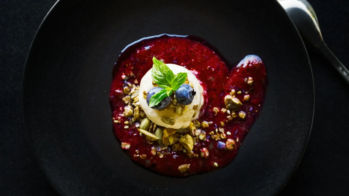
You have six people arriving at eight, a lemon tart cooling on the side and two stacks of plates on the counter. One stack is the white set from your wedding list. The other is the matte black stoneware you bought last spring because it looked so good in the shop.
You hold a slice of tart over each. On the white, it looks bright and homely. On the black, it looks like something a waiter would describe to you in a low voice. You have a vague memory of reading that food tastes sweeter on white plates, or was it that black plates make things look more expensive?
It feels like a trivial decision. A small but busy corner of experimental psychology would say it is not trivial at all, though it would also say, if you pressed it, that the answer depends on what you are serving. And some of the most quoted findings about tableware have aged badly.
Why plate colour and taste are linked: the science of crossmodal perception
What we call taste is a team effort. Alongside the tongue and nose, the brain folds in what you see, hear and feel in your hand, before you have had any say in the matter. Researchers call this crossmodal perception: one sense shaping what another reports.
The best-known figure in the field is Charles Spence, professor of experimental psychology and director of the Crossmodal Research Laboratory at the University of Oxford. He and his collaborators have run study after study on how the things around food (the plate, the spoon, the soundtrack) nudge what people say they taste, a field often called gastrophysics.
The useful way to read this work is not “plates change taste” but something narrower. In controlled conditions, changing one cue tends to shift people’s ratings by a modest amount, often in the region of 10% in lab studies. Whether that survives a noisy dinner table is a separate question. Sometimes it does. Sometimes it flips.
The white plate and the strawberry mousse study
The experiment behind the white-plate claim was published in Food Quality and Preference in 2012 by Betina Piqueras-Fiszman, Jorge Alcaide, Elena Roura and Charles Spence. Participants tasted the same pink strawberry mousse from white plates and from black plates, and from plates of different shapes. Everything about the dessert was identical. Only the plate changed.
On the white plates, the mousse was rated as tasting more intense, sweeter and more enjoyable. In a later review in the journal Flavour, Spence, Harrar and Piqueras-Fiszman put rough numbers on it: about 15% more intense, 10% sweeter and around 10% better liked. The shape of the plate, by contrast, made no measurable difference.
A plausible explanation is contrast. A pale pink dessert looks redder and more vivid against white than against black, and a brighter red reads as riper fruit. The eye makes a prediction, and the mouth seems to go along with it, at least partly.
What happened when the test moved into a real restaurant
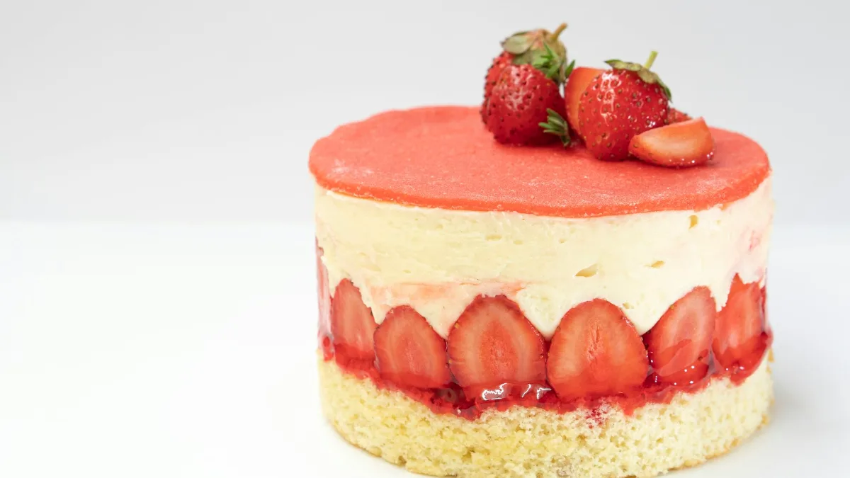
Lab results are clean because labs are boring. So in June 2012, Piqueras-Fiszman, Agnes Giboreau and Spence ran a follow-up in the working restaurant of the Institut Paul Bocuse in Lyon. They served 253 diners one of three desserts on rectangular white or black plates, and each diner saw only one version.
The result, published in Flavour in 2013, is the most useful thing any dinner host could read on the subject. For a strawberry fraisier, the white plate won clearly: diners rated it far more appetising (7.7 against 5.0 on a nine-point scale). But for a raspberry and vanilla dessert it was the black plate that won: diners liked it more (7.6 against 6.5). The headline effect on sweetness did not reach significance for any of the three desserts.
The authors were frank that the restaurant effects were weaker than in the lab, citing different drinks, different lighting at lunch and dinner, and diners chatting at their own pace. That is what an honest effect looks like when it meets real life. The plate matters, but it matters in combination with the food on it.
Round plates, angular plates and the problem of small samples
If you have ever been told that round plates make food taste sweeter, the evidence is thinner than the claim. The original mousse study found no effect of shape at all. A year later, in 2013, Peter Stewart and Erica Goss of Memorial University of Newfoundland’s Grenfell Campus tried again with sharper corners. They served slices of New York-style cheesecake on black or white plates that were either round or square, all 27 cm across.
Cheesecake on white round plates came out sweetest and most intense, which the authors put at roughly 20% higher sweetness and 30% higher intensity ratings. Quality ratings, oddly, were highest for white round plates and for black square ones. The authors concluded that colour and shape interact in ways that are not straightforward.
It is a neat finding, but look underneath it. There were 48 volunteers split across four plate types, which leaves about a dozen people per group, each tasting a single spoonful. With groups that small, a 20% difference can appear, or vanish, with a few unusual tasters. Spence’s own review mentions another study, by Simner and colleagues, that found only a small effect on perceived sharpness when food was served on a round plate versus a five-pointed star. Treat shape as an interesting maybe.
A plate cannot rescue a bad tart, but it can decide whether a good one gets noticed.
Heavier cutlery and the weight of a good meal
The cutlery findings are more consistent, and they come with a dinner-party feel built in. Spence’s group first found that yoghurt eaten from the heaviest of three otherwise identical bowls was rated about 13% more intense and 25% denser, and that people guessed it was 25% more expensive. In another early study, food was rated about 11% higher for pleasantness and quality when eaten with a heavier metal spoon rather than a plastic one.
The best test of the idea, though, happened at a lunch in the Sheraton Grand hotel in Edinburgh on 11 September 2014. Charles Michel, Carlos Velasco and Spence served conference delegates the same main course, seared sea trout with mashed potato, spinach and a caper and brown shrimp butter. Half ate with banquet cutlery, half with canteen cutlery. The weights were not subtle: the banquet fork was 84 g against 26 g for the canteen fork, and the knives were 132 g against 38 g.
Across 121 diners who completed the score sheets, those with the heavy cutlery liked the food more (5.7 against 5.1 on a seven-point scale), thought it looked more artistic (5.0 against 4.0), and said they would pay more for it: £13.90 on average, against £12.00. Published in Flavour in 2015, it is a realistic setting with a decent sample, though it was a single lunch and most of the diners who gave their sex were men.
One plausible reading is that this is association rather than physics. Heavy cutlery turns up in places where the food is expensive, so a weighty fork quietly signals that this meal is worth paying attention to. That expectation then colours the experience.


The sonic chip study: how sound changes crispness
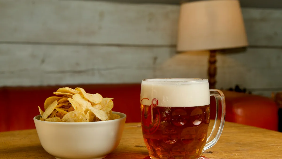
The most famous experiment in the field involves crisps and a sound engineer’s toolkit. In a paper in the Journal of Sensory Studies in 2004, Massimiliano Zampini and Charles Spence had people bite into crisps with their front teeth while the sound of each bite was electronically altered.
When the crunch was made louder, or when only the high frequencies (roughly 2 to 20 kHz) were boosted, people rated the very same crisps as crisper and fresher. The authors noted that people often did not realise the sound was doing the work. In 2008 the work earned Spence, with Zampini as co-author, the Ig Nobel Prize for nutrition.
This one has held up well as an idea. Crispness is partly an auditory judgement: we listen for freshness. For a host, the practical version is unglamorous. In a room where people are shouting over loud music, the texture of your food is competing for attention. Sound is information your guests’ brains use to judge the dish.
Red plates and snack intake: a finding that depends on the food
In 2012, Oliver Genschow, Leonie Reutner and Michaela Wänke published two studies in Appetite suggesting that red works as a brake. People drank less from a cup with a red label than one with a blue label, and ate less snack food from a red plate than from a blue or white one. The authors argued that red acts as a stop signal that works “outside of focused awareness”.
It is an appealing idea, but the follow-ups complicate it. In 2015, Reutner, Genschow and Wänke reported in Food Quality and Preference that red’s effect was stronger for unhealthy foods and faded as the options got healthier.
Then a randomised crossover trial at Hacettepe University in Ankara, published in Nutrition Journal in 2018, tested red, white and black plates at an all-you-can-eat lunch with 54 young women. The food was pasta with tomato sauce. Far from cutting intake, red plates went with more eating: about 1,102 kcal on red and 1,113 kcal on black, against roughly 946 kcal on white. That is about a sixth more on the coloured plates, though the women’s ratings of fullness and appetite did not differ between plates. The team led by Asli Akyol suggested the contrast between food and plate may matter more than the colour itself. Red sauce on a red plate is hard to see.
So the honest summary is that red plates do not reliably make people eat less. The red-as-warning effect may exist for some foods, in some settings, but it is not a diet tool.
What the newest research on plate colour adds
The field has not stood still. In 2024, Takuya Onuma published a study in SAGE Open in which 48 Japanese university students tasted four chocolates on either red or black plates. Chocolates on red plates were expected to be more bitter, yet once eaten were judged sweeter, which suggests the plate does more than set up an expectation that the mouth then confirms.
And in May 2026, a team at Universidad UTE in Quito, Ecuador, with Marcos Eduardo Valdés-Alarcón as first author, reported in Foods that 105 adults tasted a cacao dessert and a passion fruit dessert on red and black plates. The passion fruit dessert was rated about 9 points sweeter (on a 100-point scale) on red, and the cacao dessert about 10 points more bitter on black. Again, the effect depended on which dessert was on the plate. The authors listed their own limits, including only two desserts, only two colours and a laboratory setting.
The pattern across the newer work is consistent with the Lyon restaurant study: plate colour can tilt ratings, but there is no single best colour. It depends on the food and how it looks against its background.
Plate size, Brian Wansink and the illusion that shrank
No research on tableware has been more popular than the idea that smaller plates make you eat less. It drew heavily on the work of Brian Wansink of Cornell University’s Food and Brand Lab. In one 2012 paper in the Journal of Consumer Research, Koert van Ittersum and Wansink argued that a visual trick called the Delboeuf illusion, linked to the gap between the food and the edge of the plate, makes people over-serve on big plates and under-serve on small ones. One of their studies reported people serving 9.8% more than a target amount on larger plates and 13.5% less on smaller ones. The paper also suggested that changing the colour of the dinnerware or tablecloth might reduce this bias.
In September 2018, Cornell announced that a faculty committee had found Wansink committed academic misconduct, including misreporting data and problematic statistics. By then journals had retracted 13 of his papers, and he resigned. The 2012 plate-size paper carries no retraction notice in its publisher record, but evidence leaning on one discredited lab deserves fresh checking.
That checking has been done. In 2019, a team from the University of Cambridge’s Behaviour and Health Research Unit, with colleagues at Bristol and Konstanz, published a pre-registered experiment in the International Journal of Behavioral Nutrition and Physical Activity. Daina Kosīte, Gareth Hollands and colleagues gave 134 adults a self-served lunch on either a 29 cm dinner plate or a 23 cm side plate. The large-plate group ate 19.2 kcal more on average, about 3%, a difference well within what chance alone could produce. The researchers said earlier meta-analyses, built on lower-quality studies, may have overestimated the effect.
Those meta-analyses do not agree with each other either. One, by Robinson and colleagues in 2014, found no consistent effect of plate size. A Cochrane review led by Hollands in 2015 found a small to medium effect of larger tableware, but most included studies had a high or unclear risk of bias. A 2016 meta-analysis by Holden, Zlatevska and Dubelaar found a large effect when people served themselves and almost none when the portion was fixed. Kosīte’s team pointed out that three of the four studies showing large effects came from Wansink’s lab, and wrote that “due caution should be applied to their interpretation”.
Even before the scandal, the evidence was mixed. Spence’s 2012 review notes that Rolls and colleagues found no significant difference in how much people ate from 17, 22 or 26 cm plates in the lab. Smaller plates might help a little when people serve themselves. They are not the reliable trick they were sold as.
What the experiments show, at a glance
| Study | What changed | Result | How solid |
|---|---|---|---|
| Piqueras-Fiszman et al., 2012 | White vs black plate, plate shape (strawberry mousse, lab) | Mousse on white rated about 10% sweeter and 15% more intense; shape had no effect | Moderate: lab only, effect shrank in a restaurant |
| Piqueras-Fiszman, Giboreau and Spence, 2013 | White vs black plate, three desserts, 253 diners in Lyon | One dessert better on white, one better on black, no sweetness effect | Good realism, shows the effect depends on the food |
| Stewart and Goss, 2013 | Round vs square, white vs black (cheesecake) | Sweetest on white round plates | Shaky: 48 people across four groups |
| Michel, Velasco and Spence, 2015 | Heavy vs light cutlery, 121 diners in Edinburgh | Food liked more, rated more artistic, worth £13.90 vs £12.00 | Fairly solid: real meal, single event |
| Zampini and Spence, 2004 | Crunch sound electronically boosted | Louder, higher-pitched crunch made crisps seem crisper and fresher | Solid idea, Ig Nobel winner, lab only |
| Genschow et al., 2012 | Red vs blue or white plate or cup | Less snack and drink intake with red | Shaky: later work found it depends on the food |
| Akyol et al., 2018 | Red, white, black plates, pasta lunch, 54 women | More eaten from red and black than white | Moderate: randomised crossover, women only |
| Kosīte et al., 2019 | 29 cm vs 23 cm plates, 134 adults | 3% difference, not statistically significant | Strong: pre-registered |
| Valdés-Alarcón et al., 2026 | Red vs black plate, two desserts, 105 adults | Passion fruit sweeter on red, cacao more bitter on black | New, lab only, awaits replication |
How to use plate colour and taste research when you host dinner
Back to the tart and the two stacks of plates. The research does not hand you a rule, but it does give you a way of thinking. Ask what your food looks like against each background, and choose the plate that makes it look most like the best version of itself. Pale, pink or red foods tend to come alive on white. Darker, glossier or pastel desserts may look more striking on black, as the Lyon raspberry dessert did.
The rest of the room is part of the plate, too. The light, the noise level and even the walls play into what your guests expect, which is why our piece on wall colour and mood is worth a look if you are rethinking a dining room. And if you want the evening itself to land, the peak-end rule is a good reminder that pudding and the last half-hour carry more weight in the memory than the middle.
Tips for hosts
- Hold each dish over your plate options before guests arrive and pick the one with the strongest contrast.
- Serve red or pink fruit desserts on white; try darker plates for pale or glossy puddings.
- Use your heaviest cutlery for the main course. It is the most consistent finding here.
- Keep the music low enough that guests can hear the crunch of anything crisp.
- Do not rely on small or red plates to control portions. The evidence does not support it.
- Taste the food first. No plate fixes underseasoning.
None of this is a substitute for cooking well. The effects in these studies are modest, and they mostly come from people paying close attention to a spoonful in a quiet room. At your table, the bigger influences are the company and how relaxed everyone feels, which is the whole argument of our piece on what makes a home feel cosy. But when the food is good and the guests are happy, the plate is one more small lever. It costs nothing to pull it the right way.
Official links and research
- Akyol, A., Ayaz, A., Inan-Eroglu, E., Cetin, C., & Samur, G. (2018). Impact of three different plate colours on short-term satiety and energy intake: A randomized controlled trial. Nutrition Journal, 17, 46. DOI
- Genschow, O., Reutner, L., & Wänke, M. (2012). The color red reduces snack food and soft drink intake. Appetite, 58(2), 699–702. DOI
- Kosīte, D., König, L. M., De-loyde, K., Lee, I., Pechey, E., Clarke, N., Maynard, O., Morris, R. W., Munafò, M. R., Marteau, T. M., Fletcher, P. C., & Hollands, G. J. (2019). Plate size and food consumption: A pre-registered experimental study in a general population sample. International Journal of Behavioral Nutrition and Physical Activity, 16, 75. DOI
- Michel, C., Velasco, C., & Spence, C. (2015). Cutlery matters: Heavy cutlery enhances diners’ enjoyment of the food served in a realistic dining environment. Flavour, 4, 26. DOI
- Piqueras-Fiszman, B., Alcaide, J., Roura, E., & Spence, C. (2012). Is it the plate or is it the food? Assessing the influence of the color (black or white) and shape of the plate on the perception of the food placed on it. Food Quality and Preference, 24(1), 205–208. DOI
- Piqueras-Fiszman, B., Giboreau, A., & Spence, C. (2013). Assessing the influence of the color of the plate on the perception of a complex food in a restaurant setting. Flavour, 2, 24. DOI
- Spence, C., Harrar, V., & Piqueras-Fiszman, B. (2012). Assessing the impact of the tableware and other contextual variables on multisensory flavour perception. Flavour, 1, 7. DOI
- Stewart, P. C., & Goss, E. (2013). Plate shape and colour interact to influence taste and quality judgments. Flavour, 2, 27. DOI
- Valdés-Alarcón, M. E., Benalcázar-Carvajal, L. A., Sánchez-Rodríguez, A., Martínez-Vivar, R., García-Vidal, G., & Pérez-Campdesuñer, R. (2026). Contextual visual cues in dessert evaluation: A mixed-effects analysis of plate color effects on sweetness and bitterness perception. Foods, 15(10), 1629. DOI
- Zampini, M., & Spence, C. (2004). The role of auditory cues in modulating the perceived crispness and staleness of potato chips. Journal of Sensory Studies, 19(5), 347–363. DOI
Cover photo: Neven Krcmarek on Unsplash. Other photography by amirali mirhashemian, Zak Chapman and Bohdan Stocek on Unsplash.
How we reported this. Every figure was checked against the 10 sources above. Reviewed by Valentino Adkins, Senior Content Manager. Report an error · How we work