The swatches are taped to the wall in a crooked row. A sage called something like Quiet Meadow. A warm white that promises calm. A deep blue the brochure describes as “restful”, next to a terracotta that apparently “energises”. You step back, squint, and try to imagine how each one will make you feel at seven o’clock on a wet Tuesday.
Paint companies are fluent in the language of mood. Their charts read like a pharmacy shelf: this colour soothes, that one focuses, another sparks conversation. It is a lovely idea, and it borrows a lot of its confidence from science.
So let us read the chart properly. Below are the biggest claims colour psychology has made about walls and moods, taken one at a time, with the studies that launched them and the studies that came back to check.
Myth one on the chart: pink calms the furious
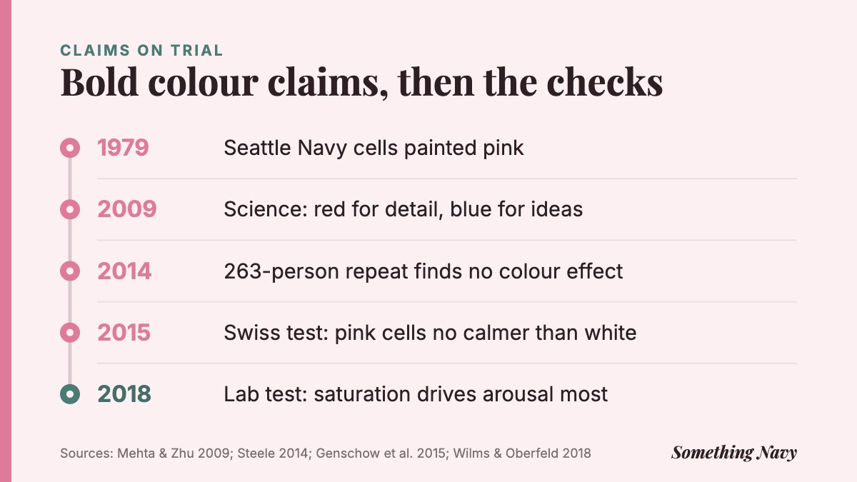
The most famous colour on the paint chart is a bubblegum pink that started life in a correctional facility.
In the late 1970s, Alexander Schauss, a researcher at the American Institute for Biosocial Research in Tacoma, Washington, became interested in whether colours could change the body as well as the mind. His early tests, often run on himself and a few volunteers, looked at heart rate and muscle strength while people stared at coloured cards. One shade of pink, which he labelled P-618, seemed to leave people weaker and calmer.
In 1979 he persuaded the directors of a US Navy correctional facility in Seattle to paint some confinement cells in it. He named the colour after them: Baker-Miller pink. According to the reports Schauss published, the Navy recorded no incidents of erratic or hostile behaviour during the first phase of confinement after the cells were painted that March, and a short exposure seemed to be enough.
The story travelled fast. Holding cells across North America were repainted. The University of Iowa’s visiting football team found its locker room painted pink, a tradition dating back to coach Hayden Fry. The shade picked up a nickname that has stuck ever since: drunk tank pink.
What the story never had was a proper trial. There was no randomisation, no blind assessment and no comparison group kept under the same conditions. A calm week in a pink cell could just as easily have been a calm week.
The Swiss cells that finally put pink to the test
It took more than three decades for someone to run the obvious experiment. A team led by Oliver Genschow, with colleagues including the social psychologist Michaela Wänke, worked with a Swiss prison where inmates who broke the rules were sent to detention cells.
What the study did
- 59 male prisoners who had violated prison rules were randomly placed in one of two kinds of detention cell.
- Half went to cells painted entirely Baker-Miller pink: walls, floor and ceiling.
- The other half went to identical cells painted white with a grey floor.
- Guards rated each prisoner’s aggression on arrival and again after three days.
The results, published in Psychology, Crime & Law, were clear. Aggression fell over three days in both groups, which is what tends to happen once someone is removed from the situation that set them off. At no point did the pink cells do better than the white ones, whether prisoners started out relatively calm or highly aggressive.
The researchers also went back over the older evidence. In one well-known strength test, prisoners pushed against an experimenter while looking at a pink or a blue card, but the experimenter could see the card too and may have pushed harder in the pink condition. Another study compared prisoners from different years who had not been randomly assigned. Either flaw alone could produce a “pink effect” out of thin air.
The authors even raised the possibility that a pink cell might backfire, if men placed in one felt mocked or humiliated. That is speculation, but it is a useful reminder that colours carry social meanings as well as wavelengths.


Myth two: red sharpens the mind, blue sets it free
If pink was colour psychology’s folk hero, the 2009 paper by Ravi Mehta and Juliet Zhu was its moment of scientific glamour. It appeared in Science, one of the most prestigious journals in the world, and it offered a neat rule anyone could use.
Mehta and Zhu, at the University of British Columbia’s Sauder School of Business, ran a series of experiments with more than 600 people, most of them working on computers with red, blue or white backgrounds. On detail tasks, such as recalling a list of words or proofreading, red backgrounds helped, by as much as 31% compared with blue. On creative tasks, such as thinking up uses for a brick, blue produced about twice as many creative ideas as red.
Their explanation was tidy. Red is linked to danger and mistakes, so it nudges people into a careful, avoid-errors mindset. Blue is linked to openness and calm, so it encourages exploring. Zhu summed it up to reporters as task dependent: “It really depends on the nature of the task.”
You can see why it caught on. Paint a home office red for the tax return and blue for the novel. Interior designers and productivity blogs still repeat it.
What happened when a lab tried it again
Kenneth Steele, a psychologist at Appalachian State University in North Carolina, took the first experiment from the Science paper and ran it again. The original had used anagrams: people unscrambled words linked either to avoiding things or to approaching them, and red supposedly sped up the avoidance words while blue sped up the approach words. The original effects were large, but the experiment involved 69 people.
Steele used the same anagrams and colours with 263 participants, giving himself a much better chance of spotting a real effect. His paper in Psychonomic Bulletin & Review reported that the colour pattern simply did not appear. People solved shorter words faster than longer ones, as you would expect, so the task was working. The background colour made no detectable difference.
One failed replication does not wipe out a whole paper with several experiments. But it changes how much weight a single striking study should bear, especially one that has been turned into decorating advice. It is the same lesson psychology learned from power poses: a small, elegant study can become a rule for living long before anyone checks it.
Why colour psychology keeps tripping over itself
The people best placed to judge the field are surprisingly candid about it. Andrew Elliot of the University of Rochester and Markus Maier of the University of Munich, two of its most active researchers, wrote a review for the Annual Review of Psychology in 2014. They concluded that colour can carry meaning and affect how people feel, think and behave, but that the research is still young, and that firm practical recommendations would be premature.
A year later, in a review in Frontiers in Psychology, Elliot listed what had held the field back. Early studies often failed to blind experimenters, did not screen for colour blindness and did not control how long people looked at a colour. Many later studies did not measure the colours they showed precisely, or ignored lighting, viewing distance and background.
Findings from small sampled studies should be considered preliminary.
Andrew Elliot, Frontiers in Psychology (2015)
Then there is the problem of sample size. Small studies can inflate effects or miss real ones, and colour research has run on a lot of small studies. Elliot described theory in the area as still at a “nascent level of development”.
That does not mean colour does nothing. Elliot’s own work on red and attraction is a case in point, and we have looked at whether red really makes people more attractive separately. It means the confident one-colour, one-feeling rules on a paint chart are running well ahead of the evidence.
Myth three: the hue is the whole story
Here is the twist that paint charts rarely mention. When researchers do control colour carefully, the name of the colour (red, blue, green) turns out to be only part of what matters. How bright it is, and how saturated or muted, can matter just as much.
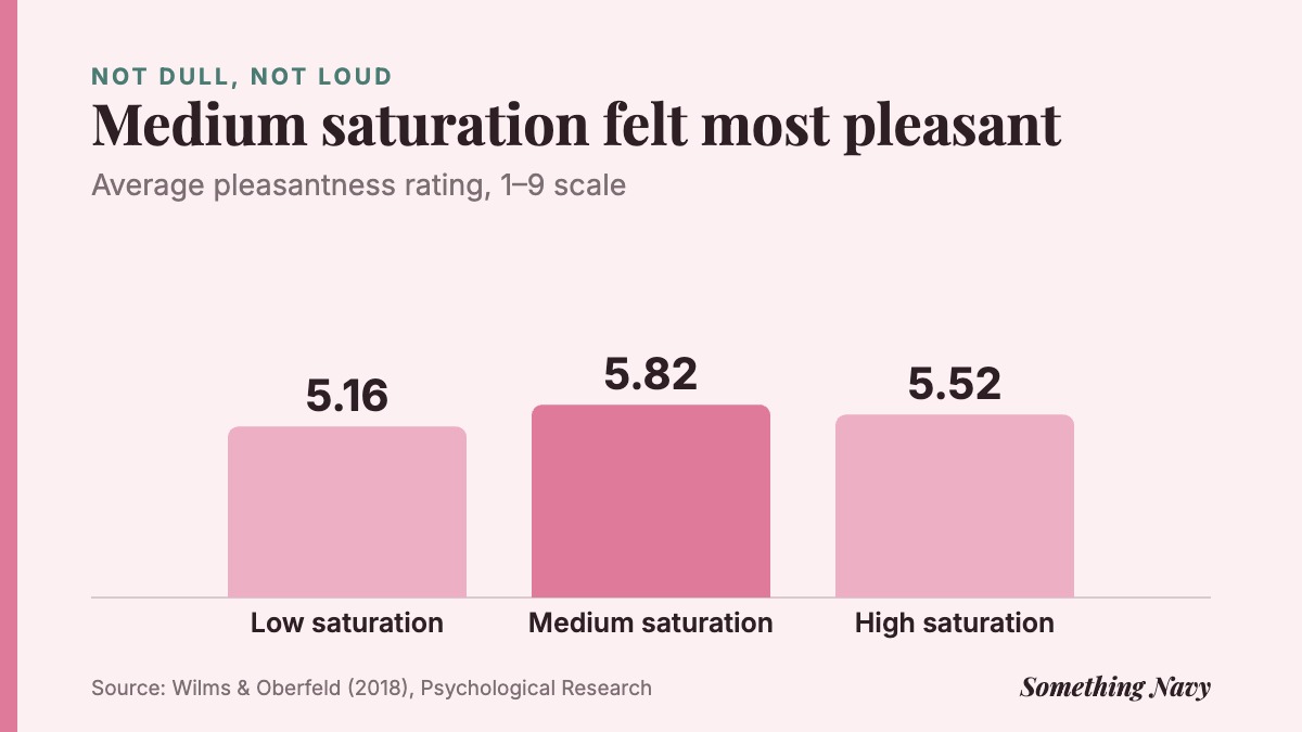
In a study published in Psychological Research, Lisa Wilms and Daniel Oberfeld of Johannes Gutenberg University Mainz showed 62 people a set of 30 colours on a large LED panel in a darkened booth. The colours were blue, green and red, each at three levels of saturation and three of brightness, plus three greys. Each was viewed for 30 seconds, after which people rated how aroused and how pleasant they felt, while skin conductance and heart rate were recorded.
Saturation had the strongest effect on arousal: the more intense the colour, the more stirred up people felt. Brighter colours were more arousing too. Hue did matter, with arousal rising from blue to green to red, but mainly when colours were vivid. When it came to pleasantness, hue alone did not make a reliable difference.
The most pleasant level was the middle one. On a nine-point scale, moderately saturated colours averaged 5.82, against 5.52 for intense versions and 5.16 for washed-out ones, and the greys were rated least pleasant of all.
This was a lab study with mostly young women looking at glowing panels for half a minute, not people living with painted walls for years. But it explains why “blue is calming” can be both true and false. A soft, dusty blue and an electric cobalt are both blue. They are not the same experience.
Myth four: everyone feels the same about the same colour
Paint charts assume a universal reaction. Preference research suggests something more personal and more interesting.
Stephen Palmer and Karen Schloss at the University of California, Berkeley, asked 48 people to rate how much they liked 32 colours. Separate groups described the objects each colour reminded them of and rated how much they liked those objects. Combining those associations predicted around 80% of the variation in average colour preference, as the pair reported in PNAS in 2010.
Blues, the colour of clear skies and clean water, came out on top. Dark yellows and browns, which people linked with things like rotting food, came near the bottom. In the authors’ words, people like colours “strongly associated with objects they like”.
That has a quiet implication for your walls. If a green reminds you of a hospital corridor you spent a bad week in, no brochure will make it feel restful to you. Your history with a colour is part of the colour.

The light changes the paint
Anyone who has painted a room knows the moment: the colour that looked perfect on the card turns murky on the wall, or sharp and cold in the morning. That is not just fussiness. Brightness, as the Mainz study showed, is one of the things that shapes how a colour feels, and the brightness of a wall depends heavily on the light that hits it.
A north-facing room gets cooler, flatter daylight than a south-facing one. Warm evening bulbs pull colours towards yellow. A small card held at arm’s length is also a very different object from four walls surrounding you. This is exactly the kind of thing Elliot criticised early studies for ignoring, and it is exactly what decides whether your chosen shade looks gentle or grim.
It also suggests that the mood of a room is never just its paint. Daylight, lamps, mess and noise all compete for the job. If you are trying to make a space feel calmer, it is worth reading about how clutter relates to stress before you blame the walls.
What a paint chart can honestly promise
None of this means colour choice is meaningless. It means the useful questions are different from the ones on the brochure. Instead of asking which colour “causes” calm, ask how intense the colour is, how it behaves in your light, and what it means to you.
A few principles hold up reasonably well. Very saturated colours tend to feel more stimulating, so a fully saturated red bedroom is a bolder choice than a muted one. Moderately saturated shades tend to feel more pleasant than either extreme. And your own associations matter more than any general rule.
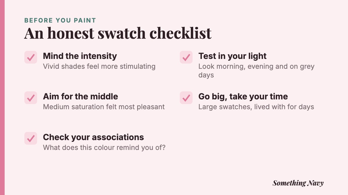
Test large swatches, ideally painted on card you can move around, and look at them at different times of day. Live with them for a few days before deciding. If a colour still feels right on a grey morning and under evening lamps, that tells you more than any label.
Living with the colour you choose
There is one more effect the science hints at, and it may be the most reliable of all. The Swiss prisoners calmed down in both cells because time passed. People adjust. The mere exposure effect suggests we often grow to like what becomes familiar, and a wall you see every day becomes very familiar indeed.
So pick the swatch that you like, in your light, at a saturation that feels comfortable. Do not expect it to fix your temper or write your novel. Drunk tank pink could not manage that in a prison cell.
What a colour can do is make a room feel like yours, and that, unlike most of the paint chart, is a claim you can test yourself.
Frequently asked questions
There is no good evidence that it does. The best controlled test, in Swiss detention cells, found pink cells were no better than white ones at reducing aggression over three days.
Blue is the most widely liked colour on average, but research suggests saturation and brightness shape how a colour feels as much as its hue. A soft, muted shade you personally like is a better bet than any colour chosen for its reputation.
The 2009 study behind that idea used coloured computer screens, not walls, and a larger repeat of one of its key experiments found no effect. There is no solid reason to repaint for productivity.
The light in your room, the size of the painted area and the colours around it all change how a shade looks. Testing large swatches at different times of day gives a much truer picture.
Sources
- Elliot, A. J. (2015). Color and psychological functioning: A review of theoretical and empirical work. Frontiers in Psychology, 6, 368. DOI
- Elliot, A. J., & Maier, M. A. (2014). Color psychology: Effects of perceiving color on psychological functioning in humans. Annual Review of Psychology, 65, 95–120. DOI
- Genschow, O., Noll, T., Wänke, M., & Gersbach, R. (2015). Does Baker-Miller pink reduce aggression in prison detention cells? A critical empirical examination. Psychology, Crime & Law, 21(5), 482–489. DOI
- Mehta, R., & Zhu, R. J. (2009). Blue or red? Exploring the effect of color on cognitive task performances. Science, 323(5918), 1226–1229. DOI
- Palmer, S. E., & Schloss, K. B. (2010). An ecological valence theory of human color preference. Proceedings of the National Academy of Sciences, 107(19), 8877–8882. DOI
- Steele, K. M. (2014). Failure to replicate the Mehta and Zhu (2009) color-priming effect on anagram solution times. Psychonomic Bulletin & Review, 21, 771–776. DOI
- Wilms, L., & Oberfeld, D. (2018). Color and emotion: Effects of hue, saturation, and brightness. Psychological Research, 82, 896–914. DOI
Cover photo: Linh Pham on Unsplash. Charts and graphics: Something Navy.
How we reported this. We went back to the original research for this story, 7 sources in all, listed above, and checked every figure against them. If you think we have got something wrong, tell us and we will look at it. Read more about how we work.